Exclusive Summary
Innisfree is a South Korean naturalism-oriented cosmetics brand created by Amore Pacific. It has stores around the world. It is known for being South Korea's first all-natural brand, and many of the product ingredients are sourced from Jeju Island. The company's products range from makeup to skin care products for women and for men. As an online shopping website, its US website provides customers with most kinds of products and enables users to know more information about its brand.
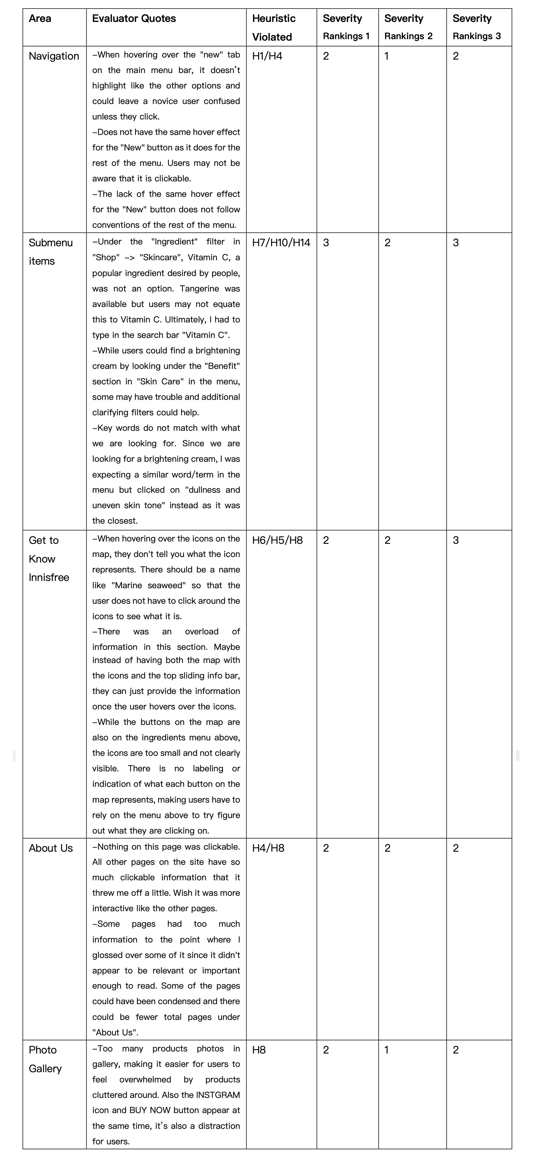
As described in detail in the report, a Heuristic Evaluation of Innisfree US website was conducted to find areas in need of improvement. Nielsen’s Ten Usability Heuristics for User Interface Design is used for assessing usability in this report. Three evaluators were given four scenarios of different function, then recorded usability issues encountered based on Nielsen’s Ten Heuristics principles and rated the severity of each issue. As the lead evaluator, I compiled all of the problem descriptions and identified the major usability problems. The report puts forward four corresponding suggestions for these usability issues.
Recommendation1: Provide clear and efficient navigation
Recommendation2: Make interaction simpler and visible
Recommendation3: Highlight priorities in photo display
Recommendation4: Condense similar content to single page
Introduction
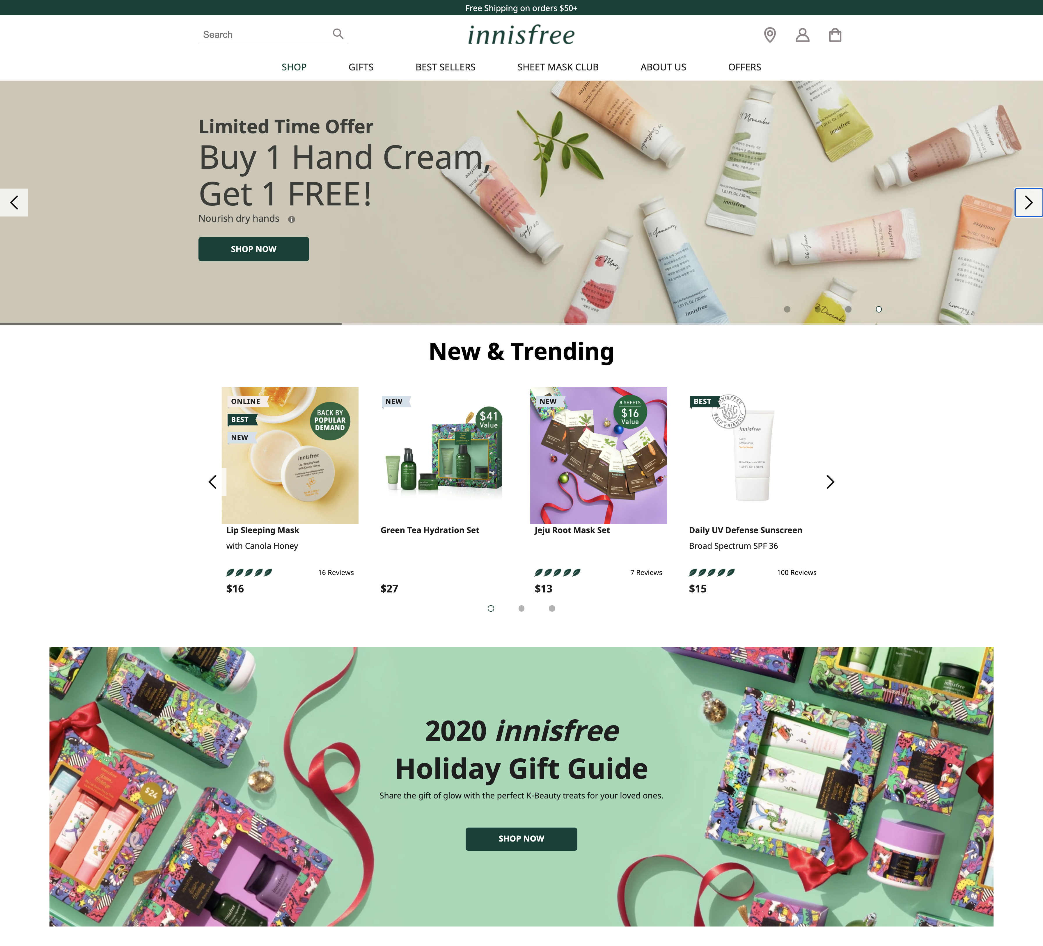
Figure 1 Homepage ofInnisfree
This report analyzes data compiled from Heuristic Evaluation of Innisfree US official site. The design of website is based on the brand tone itself,reflecting the brand idea of nature, health and environmental protection. As the leading online sales channel of brand in the US market, the design improvement of site would be able to help product sales directly.
The heuristic evaluation is a usability inspection method that helps to identify usability problems. Evaluators examine and judge interface’s compliance with recognized heuristic principles. This method gives UX researchers a standard way to conduct evaluation effectively.
During the remote evaluation, three evaluators were given four scenarios, mainly focusing on the homepage of site and exploration of product. Every usability issue encountered were recorded and rated based on the Nielsen’s Ten Heuristics principles. As the lead evaluator, I compiled all of the problem descriptions, identified the major usability problems and presented recommendations for these problems.
Methodology
Heuristic evaluation uses a set of simple, generic, and heuristic principles to do usability evaluation. Multiple evaluators discover usability issues of product on the basis of generic usability principles and their own experience. Heuristic evaluation has the following characteristics: 1) Interactive experts evaluate the compliance of user interface with heuristic principles; 2) Evaluators simulate the situation of typical users using the product to identify potential problems; 3) The number of evaluators participating in the assessment is not fixed, 3 to 5 members would be suitable; 4) It’s a relatively quick and cost effective method, thus it’s also known as “discount method” of usability evaluation; 5) The accuracy of heuristic evaluation is not high enough.
Nielsen's Ten Usability Heuristics for User Interface Design
H1:Visibility of system status
H2:Match between system and the real world
H3:User control and freedom
H4:Consistency and standards
H5:Error prevention
H6:Recognition rather than recall
H7:Flexibility and efficiency of use
H8:Aesthetic and minimalist design
H9:Help users recognize, diagnose, and recover from errors
H10:Help and documentation
Severity Ratings for Usability Problems
1 –Cosmetic: Need only fix if time is available
2– Minor: Fixing this should be low priority
3– Major: Important to fix and should have high priority
4– Catastrophic: Imperative to fix before release
See Appendix for further details regarding heuristics and severity ratings.
Scenarios & Tasks
The evaluation of Innisfree US website was conducted remotely by three participates. The lead evaluator shared written instructions with other evaluators. Then each member individually completed a series of tasks, reviewed the interface according to Nielsen principles and recorded problem encountered.
Task
You are a customer of Innisfree for several years, usually shop offline. Now you want to browse around and buy some products online by Innisfree US official website.
Scenario
Find the new product page by using the navigation.
Find a cream which has brightening benefit and contains vitamin C, and the following information about this cream: 1) Price; 2) Ingredient; 3) Reviews
In"Get to Know Innisfree" area, find the information about marine seaweed, also the corresponding icon on the map.
Browse the content under ABOUT US-Jeju Heritage, get to know some brand information.
These scenarios focus on the UX design of homepage, containing navigation, product categories, main content and search function, also product details page and brand introduction page.
Findings & Recommendations
Analysis of Evaluation
Altogether, evaluators identified five issues, which can be addressed by four recommendations (See Appendix: HeuristicEvaluation Table) . Each recommendation is detailed below along with mock-ups for potential solution. Meanwhile, the issues reported mainly appeared on the homepage. As the homepage of e-commerce website, the design of every part needs skills and thoughts to ensure both the complete display of business and the satisfaction of user experience. As a Korean cosmetics brand in vertical marketplace, Innisfree US site is different from integrated shopping mall website facing all users. It needs to maintain a specific design atmosphere and precise visual means. Therefore, the homepage of Innisfree US website needs to be focused on for optimization.
Recommendation #1: Provide clear and efficient navigation
First, recommendation 1 is intended to address the design issues of navigation, including main menu and sub-menu. It’s noted as “3- Major” and “2- Minor”severity ratings by most evaluators (See Navigation part in the Appendix). The issue description can be condensed as follows:
Issue of Navigation:
Some buttons of menu do not have the same hover effect as the rest of the menu, which could leave novice users confused.
The lack of clear instruction for navigation caused difficulty in finding a certain type of product.
According to evaluators, the first problem is the consistency of hover effect of different buttons. Some buttons have no clear signifier for users to click. This problem can be solved by creating a unified visual effect. The second problem is the difficulty in finding a certain type of product, which can be further understood as the lack of guidance and classification capability of main menu to help users locate products rapidly. The solution of this issue could be the overall improvement of navigation design, including optimization of both visual style and information architecture.
In addition, several items in navigation are duplicate. Such as “Sets & Gift” under SHOP is the same as “GIFT”of mean menu, also “Best Sellers” is the same as “BEST SELLERS”.

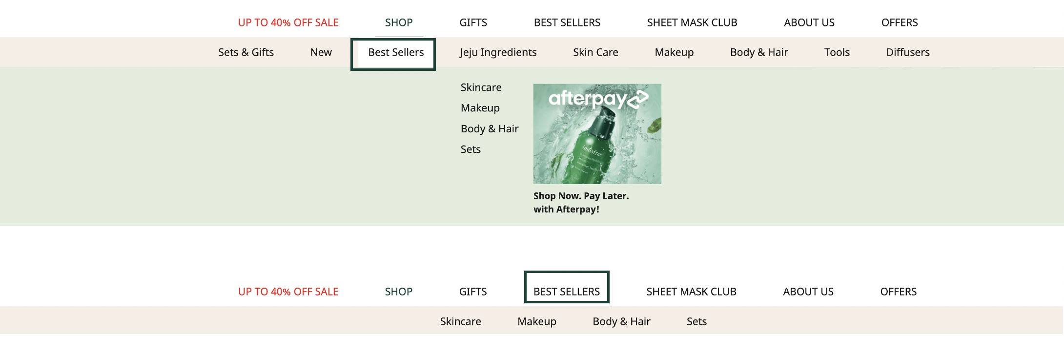
Figure 2 Screenshot of Navigation
More importantly, the sub-menu under the SHOP contains as many as 8 items, with large span but small height, which makes it difficult to move to third level menu. Users have to be very carefully to prevent moving away from the hot spot of SHOP button and sub-menu. Take the process of locating Hand Lotion as an example, users should move to Body &Hair in a narrow sub-menu, and then move to Hand Lotion. The click rate fall and customer loss caused by such a long path are observable.
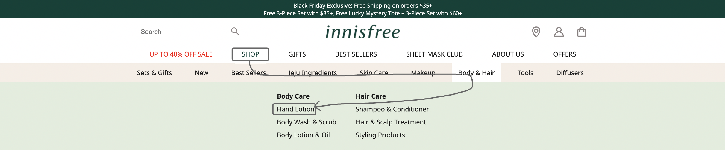
Figure 3 Path of LocatingHand Lotion
Recommendation:
The improvement direction is mainly reflected in two aspects: increase operating area and reduce choices. First, increase height of sub-menu, while reducing the difficulty of operation. Similarly, the area of SHOP button hotspot should be increased. Secondly, remove two duplicate items in sub-menu (Sets & Gifts and Best Sellers) and optimize the sorting of items, thereby reducing the operating cost of user and raising efficiency.
Meanwhile, there is a potential problem. Product categories, the core function of website, are displayed in the sub-menu of SHOP, but SHOP isn’t highlighted because it has the same style as the other items of main menu. It is suggested to display SHOP more prominently, attracting users to click, helping users quickly understand the product types and find the product they need.
Figure 4 Mock-up of Navigation
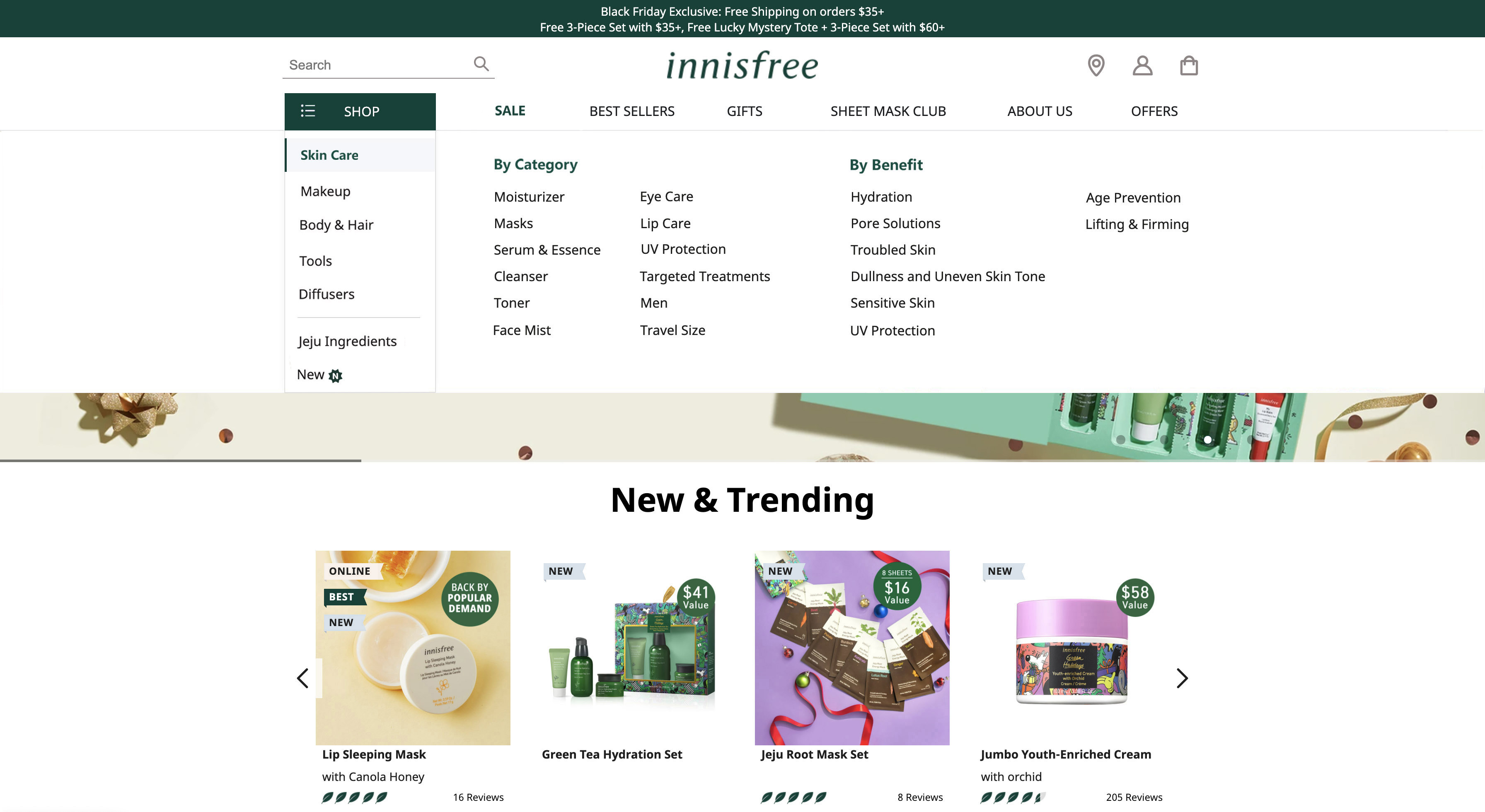
Figure 5 Mock-up of Sub-menu
Recommendation #2: Make interaction simpler and visible
Second recommendation is intended to provide a revised version of design for Get to Know Innisfree part. It’s noted as “2-Minor” severity rating by two evaluators. Description by evaluators can be condensed as follows:
Issue of Get to Know Innisfree:
While the buttons on the map are also on the ingredients menu above. There was an overload of information in this section. There is no labeling or indication of what each button on the map represents, making users have to rely on the menu above to try figure out what they are clicking on.
As described by evaluators, after clicking an ingredient icon on the map, users need to go back to sliding info bar above to view information, which has a high barrier to understand, also brings trouble to operation. And it’s also obvious that the icon keeps blinking once clicked, which also makes users feel nervous. Overall, although interactive map is creative, there is still room for improvement.
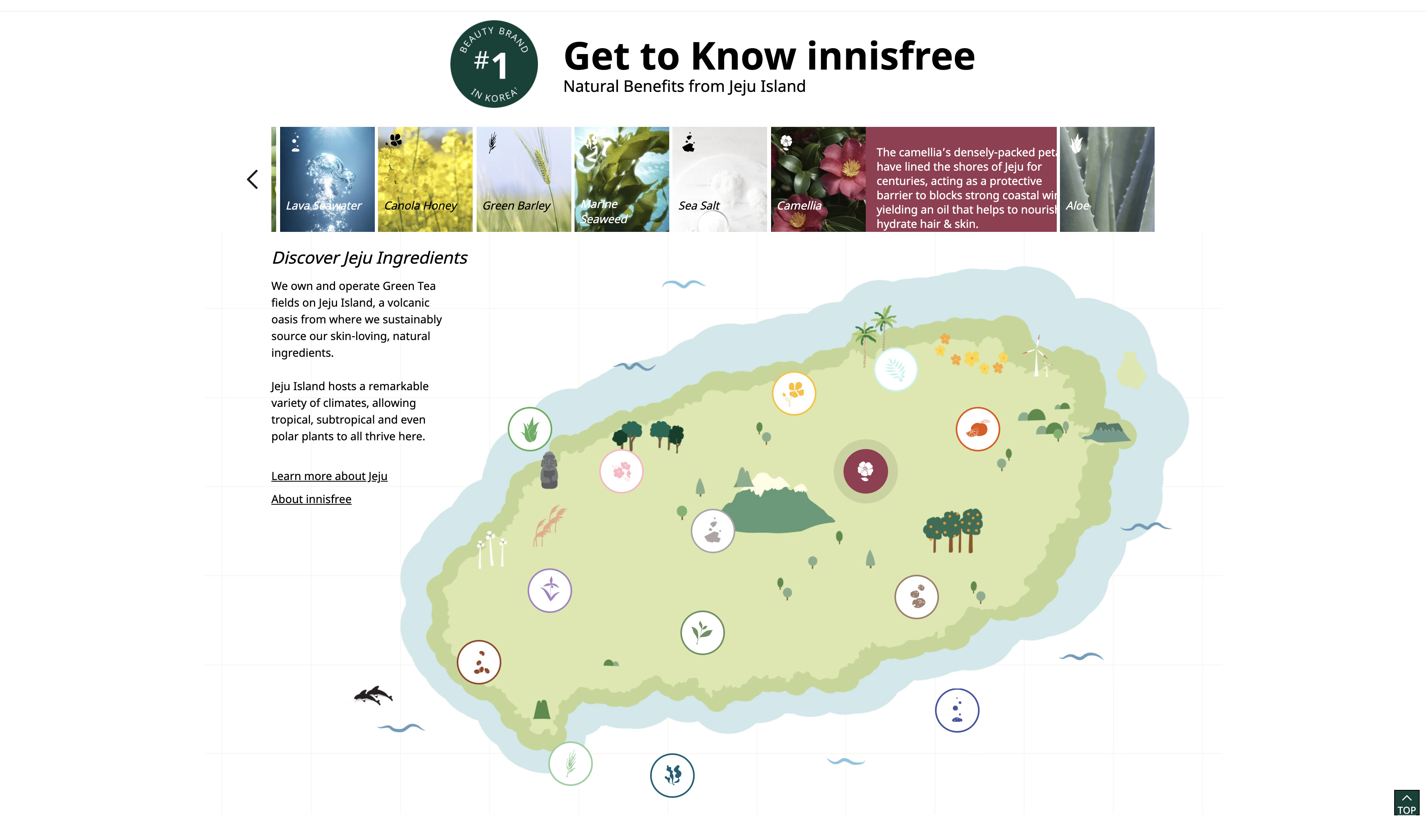
Figure 6 Screenshot of Get to Know Innisfree
Recommendation:
Two evaluators both believe that the expected solution is to display the ingredient name directly when hover on it, the map and top info bar don’t need to link with each other. Instead of scrolling up to view information, users only need to operate on map. This is an effective way to make complex interaction simple and visible.
Meanwhile, considering the top info bar still contains useful information, it can’t be removed directly. Therefore, it is recommended to keep map as the first part and info bar as the second part, and two parts should be displayed independently, which allows user to quickly understand types and geographical distribution of ingredients, and then to learn the details of each ingredient.
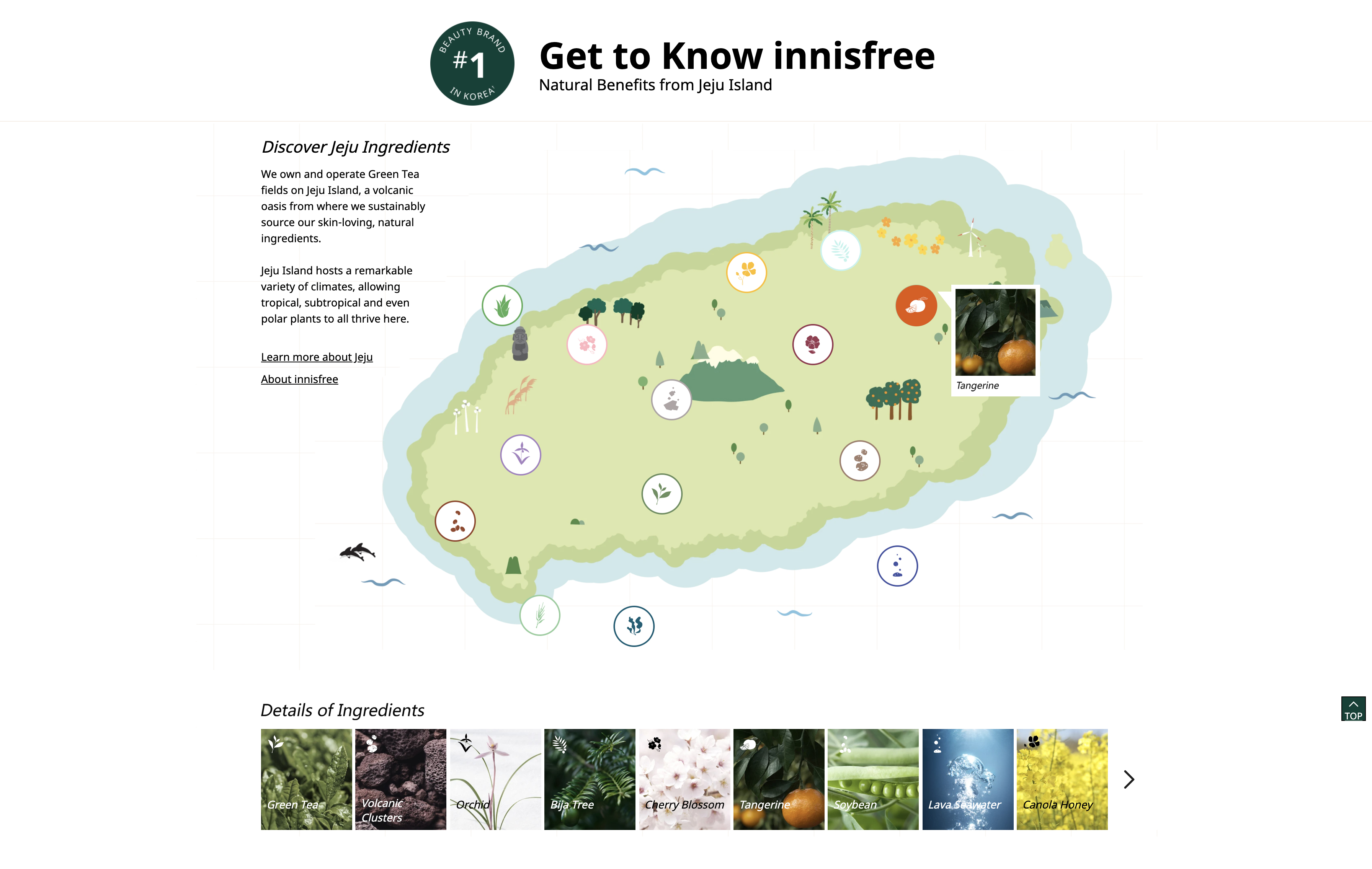
Figure 7 Mock-up of Get to Know Innisfree
Recommendation #3: Highlight priorities in photo display
Recommendation3 is intended to address the design problem of photo gallery part. It’s noted as “2- Minor” severity rating by two evaluators (See Photo Gallery issue in theAppendix). The description can be simplified as follows:
Issue of Photo Gallery:
Too many products photos in gallery, making it easier for users to feel overwhelmed by products cluttered around. Also the INSTGRAM icon and BUY NOW button appear at the same time, it’s also a distraction for users.
As shown in the figure 5, there are a large number of photos in gallery. Too many choices leads to visual noise, decreasing user’s desire to click “load more”. Besides, the photos show both INS icon and Buy Now button when hover on them, and INS icon is also clickable, making it easier for user to feel confused.
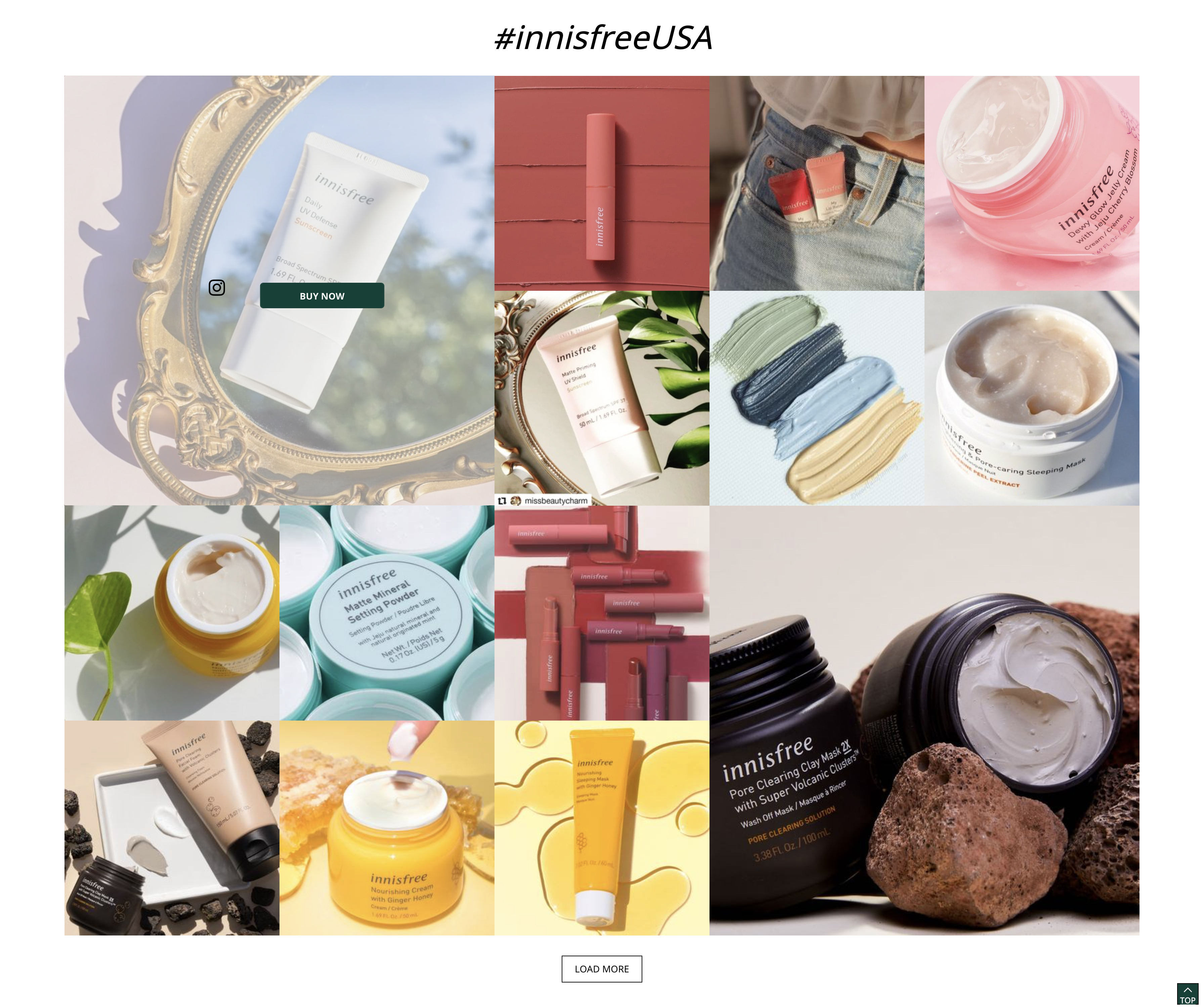
Figure 8 Screenshot of PhotoGallery of Product
Recommendation:
Firstly, reduce the number of blocks, and display the products in a more modular and organized way. The fewer elements means the more whitespace, the more attention will each element get. Same product series can be combined together, and give priority to show star product series. For number of groups, three or four product series groups by default could be suitable. Meanwhile, INS icon should be changed to unclickable. And Buy Now could be changed to “See Details”, thus the decision-making cost of user will be lower.
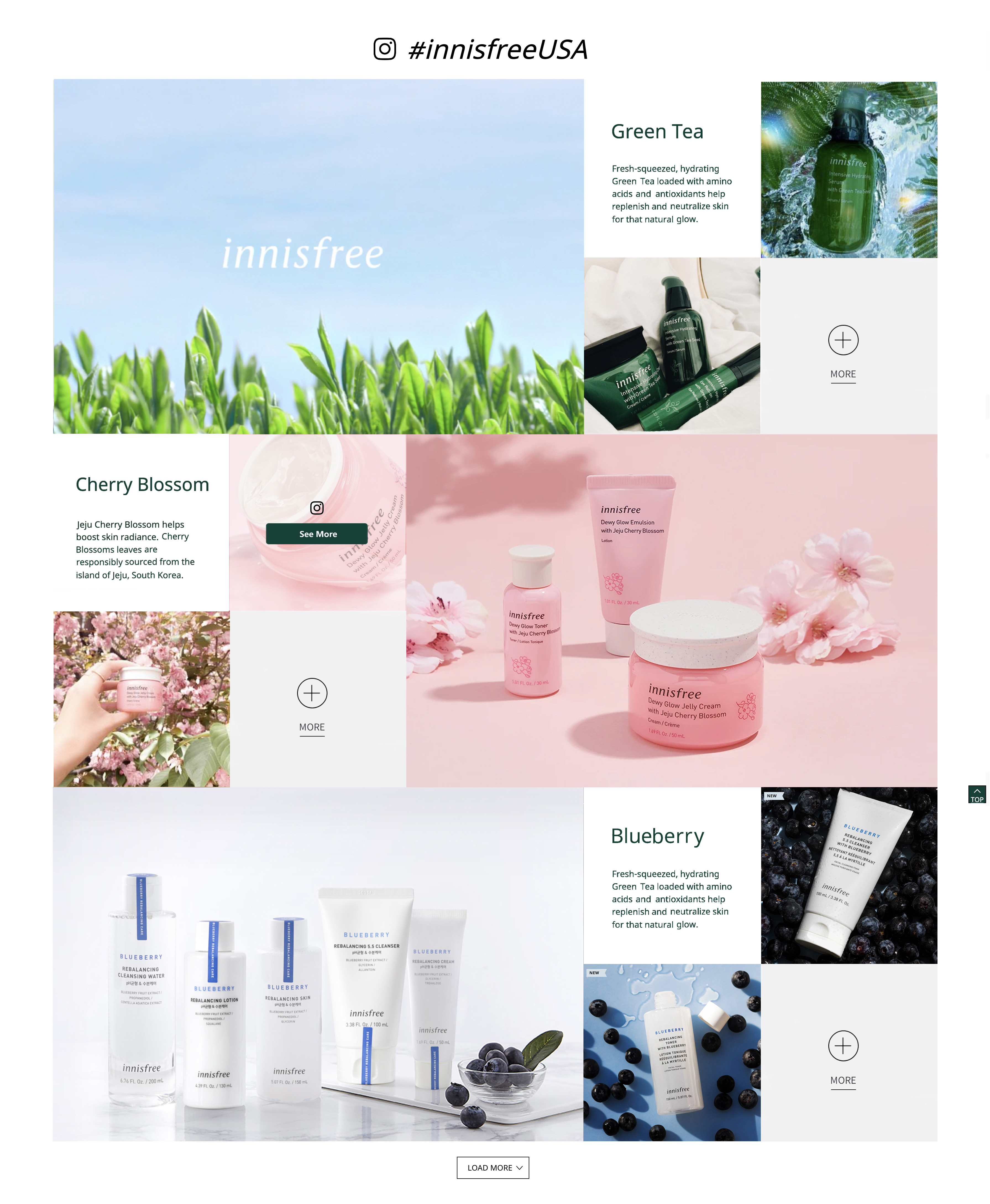
Figure 9 Mock-up ofPhoto Gallery
Recommendation #4: Condense similar content to single page
The final recommendation addresses the issue of ABOUT US part. ABOUT US contains too many sub-pages, and most of pages have little content, which increases invalid content to navigation and distract clicks from users.
Issue of About Us:
Some pages had too much information to the point where I glossed over some of it since it didn't appear to be relevant or important enough to read. Some of the pages could have been condensed and there could be fewer total pages under"About Us".
As described by evaluators, the content of ABOUT US need to be improved as a whole, and the sub-pages of Jeju Heritage and Green Life can be condensed to single pages.
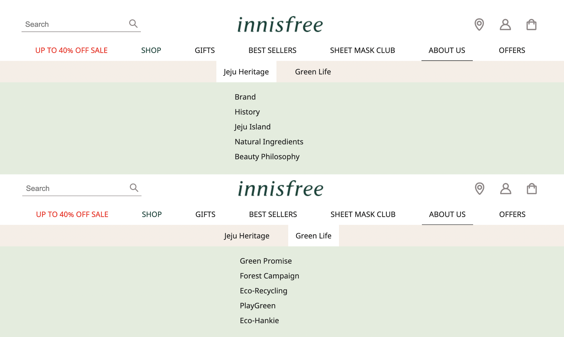
Figure 10 Screenshot of ABOUT US
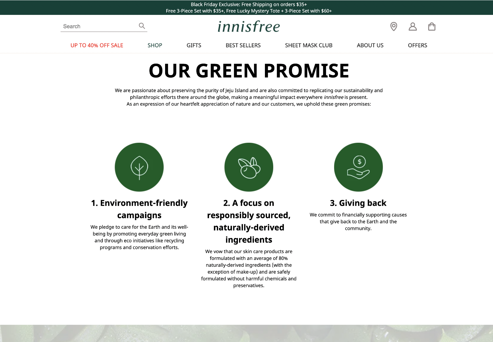
Figure 11 Screenshot ofGreen Promise
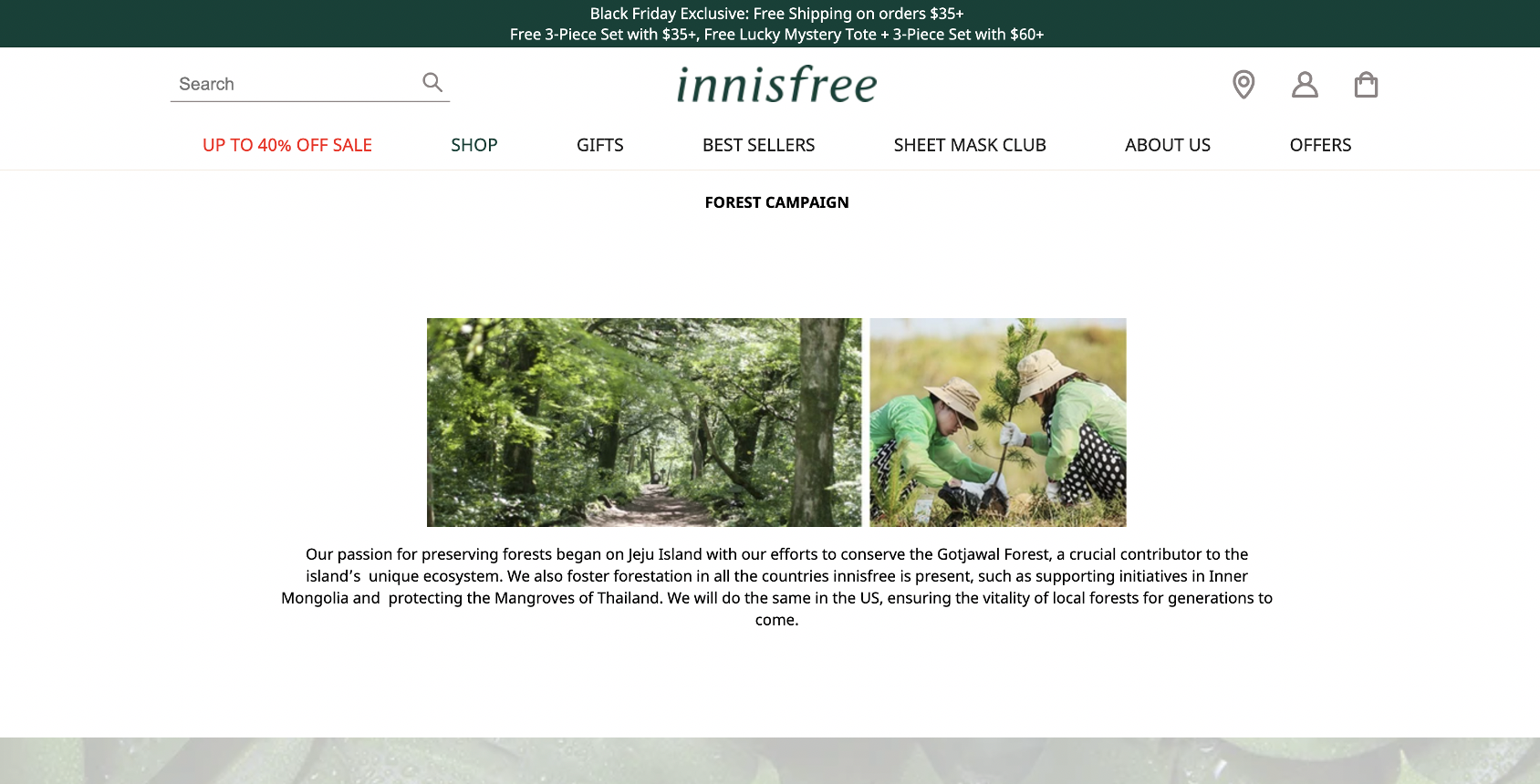
Figure 12 Screenshot ofForest Campaign
Recommendation:
Most sub-pages contain no more than one page content, thus these pages can be condensed to single page distinguished by side anchor.
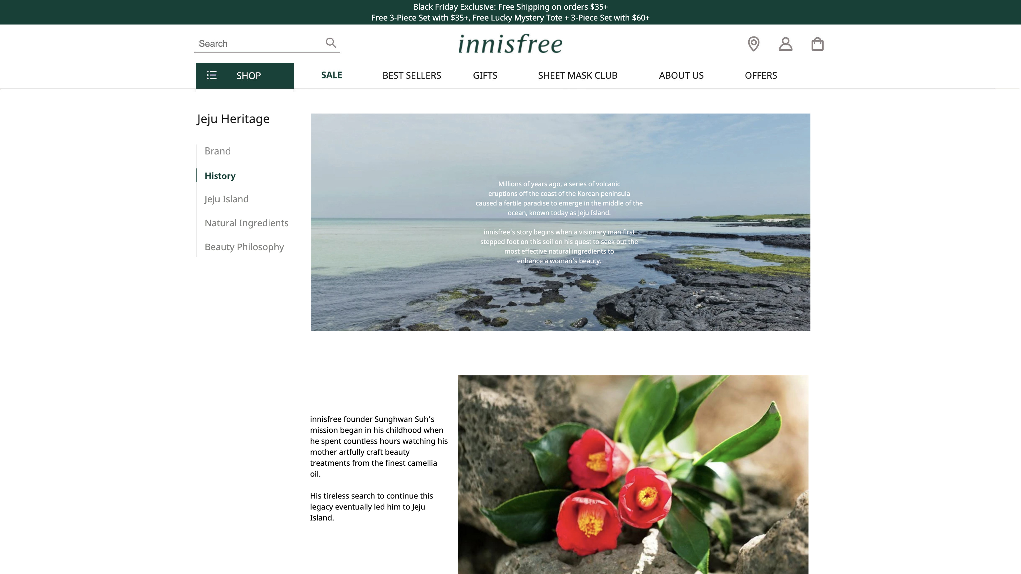
Figure 13 Mock-up of Condensed Page
Conclusion
Through heuristic evaluation, the information provided by evaluators allowed us to take an in-depth look at the potential design issues of Innisfree US website. Evaluators identified five usability issues, mainly concentrate on homepage, addressed by four recommendations:1) Provide clear and efficient navigation; 2) Make interaction simpler and visible; 3) Highlight priorities in photo display; 4) Condense similar content to single page.
This study has shown that clear, organized, and considerate design is of the utmost importance in helping users effectively use an e-commerce site. Meanwhile, as the online store, providing customers with enjoyable shopping experience is essential to business success. Because of the complexity of large amount of products, making sure users can quickly and easily navigate to the products they need is the focus for this evaluation.
Appendix
Nielsen’s TenUsability Heuristics for User Interface Design
H1.Visibility of system status The system should always keep users informed about what is going on, through appropriate feedback within reasonable time.
H2.Match between system and the real world The system should speak the users' language, with words, phrases and concepts familiar to the user, rather than system-oriented terms. Follow real-world conventions, making information appear in a natural and logical order.
H3.User control and freedom Users often choose system functions by mistake and will need a clearly marked"emergency exit" to leave the unwanted state without having to go through an extended dialogue. Support undo and redo.
H4.Consistency and standards Users should not have to wonder whether different words, situations, or actions mean the same thing. Follow platform conventions.
H5.Error prevention Even better than good error messages is a careful design which prevents a problem from occurring in the first place. Either eliminate error-prone conditions or check for them and present users with a confirmation option before they commit to the action.
H6.Recognition rather than recall Minimize the user's memory load by making objects, actions, and options visible. The user should not have to remember information from one part of the dialogue to another. Instructions for use of the system should be visible or easily retrievable whenever appropriate.
H7.Flexibility and efficiency of useAccelerators-- unseen by the novice user -- may often speed up the interaction for the expert user such that the system can cater to both inexperienced and experienced users. Allow users to tailor frequent actions.
H8.Aesthetic and minimalist design Dialogues should not contain information which is irrelevant or rarely needed. Every extra unit of information in a dialogue competes with the relevant units of information and diminishes their relative visibility.
H9.Help users recognize, diagnose, and recover from errors Error messages should be expressed in plain language (no codes), precisely indicate the problem, and constructively suggest a solution.
H10.Help and documentation Even though it is better if the system can be used without documentation, it may be necessary to provide help and documentation. Any such information should be easy to search, focused on the user's task, list concrete steps to be carried out, and not be too large.
Nielsen’s Severity Ratings for Usability Problems
0= I don't agree that this is a usability problem at all
1= Cosmetic problem only: need not be fixed unless extra time is available on project
2= Minor usability problem: fixing this should be given low priority
3= Major usability problem: important to fix, so should be given high priority
4= Usability catastrophe: imperative to fix this before product can be released
HeuristicEvaluation Table
The table records the usability issues encountered by three evaluators, and grouped by similar area. Issue description, heuristic violated and severity rankings are included.
Reference
Nielsen, J. (n.d.). Nielsen NormanGroup. 10 Heuristics for User Interface Design: Article by Jakob Nielsen.Retrieved 2/26/2018, from http://www.nngroup.com/articles/ten-usability-heuristics/
Nielsen, J. (n.d.). Nielsen NormanGroup. Severity Ratings for Usability Problems: Article by Jakob Nielsen.Retrieved 2/26/2018, from https://www.nngroup.com/articles/how-to-rate-the-severity-of-usability-problems/
Nielsen, J. (n.d.). Nielsen NormanGroup. How to Conduct a Heuristic Evaluation: Article by Jakob Nielsen.Retrieved 2/27/2018, fromhttps://www.nngroup.com/articles/how-to-conduct-a-heuristic-evaluation/
