International Women's Health Coalition

Website Redesign
Project Overview
IWHC is a non governmental organization focuses on issues relating to women and girl's human rights, health and equality and represents part of the women's movement that recognizes that many challenges to gender quality lie in challenges in health issues and in raising families.
Members Contributions
Team Members: Aimen Awan, Mikkey Tokuhira, Mingqi Rui, Yisha Su
My Role: User interview/ Ideation sessions/ Low fidelity prototype/ Design review/ Edition of final PPT
1. Scope
Setting the objective for this project
Our Challenge
How Might We make it easier for visitors to understand IWHC's mission, target issues, background, and capabilities, and inspire visitors to donate?
Kick-off Meeting with the Client

In kick-off meeting, we understood our objective. First, find experience problems in the current website and give better solution. Second, redesign the website to inspire visitors to take action.

Target Audience
  • Looking to learn more about IWHC
  • Interested in supporting women's rights/ looking for an organization to make donations to
  • Looking to collaborate with women's rights group
Project Timeline
2. Research & Discovery
Identify the opportunities to improve user experience
Website Audit
The purpose of the website audit was to understand navigation on the current and performance of the current website.
Works Well
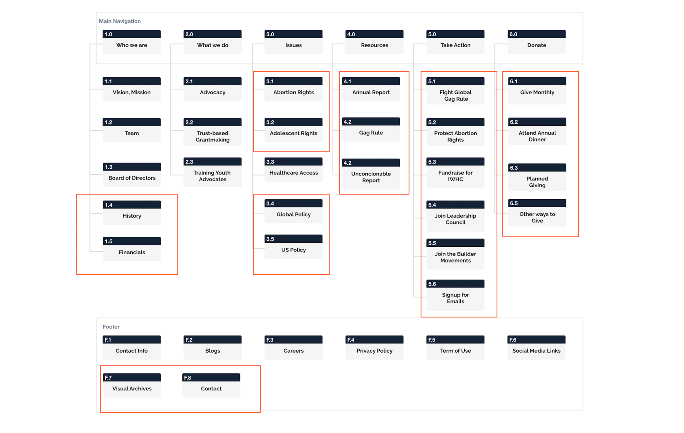
-All pages have proper headings(H1) and title
-There are 3 levels of hierarchy
-Each page has metadata and keywords
-Quick page loads
Improved Needed
-61 pages are accessible directly by navigation.
-75% of pages exist at third level of hierarchy
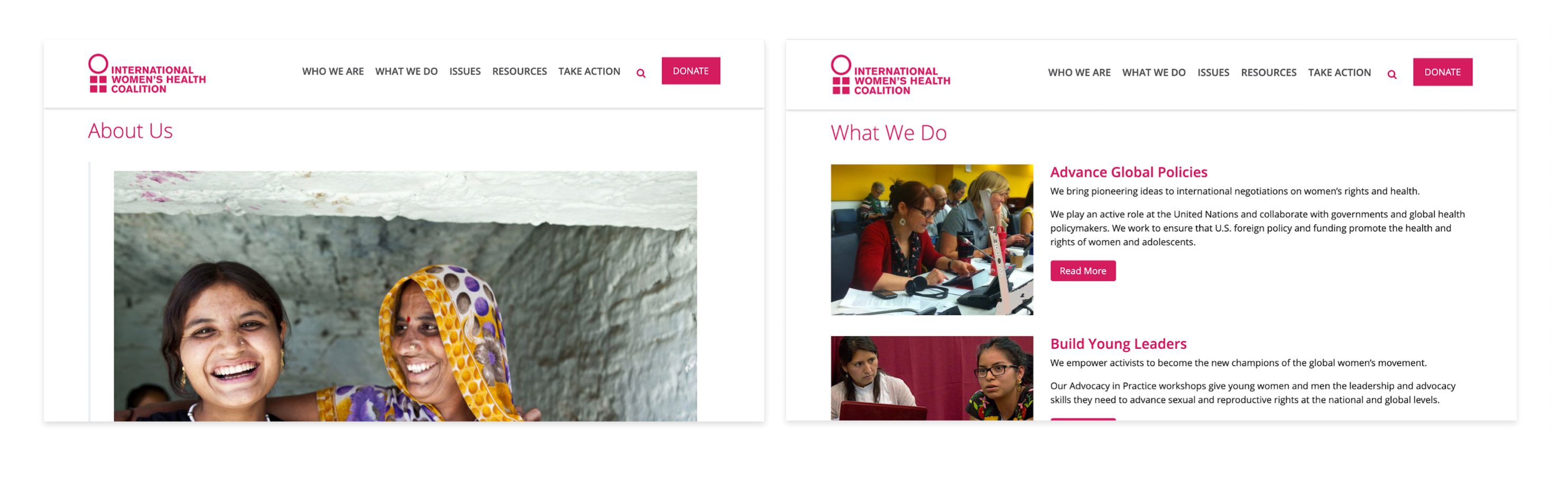
-Internal pages are designed as categories of blog
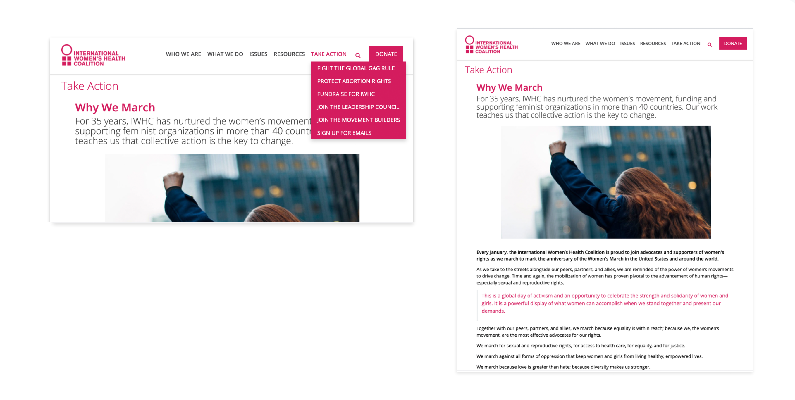
-Labels and titles are not consistent
Competitor Analysis
Do's
  • Clear call-to-action that displays ways that users can interact with the organization
  • Information displayed in the order which matches user's behavior while navigating through the site
Don's
  • Too much information on homepage with no hierarchy in the information
  • Unclear call to actions
User Feedback on Current Site
"How is this organization different from other similar organizations?"
"What issues are they solving?"
"What am I donating to? What cause am I helping?"
"How will the money be used if I donate?"
"Where did the statistics come from? Are these numbers trustable?"
Potential Solutions based User Feedback
  • Effectively communicate what the organization stands for by clearly stating the below in the top part of the home page
    Missions
    Strategies & Capabilities
    Issues being tackled
  • Simplify navigation
    Organize the information architecture to provide more intuitive navigating experience through the site
  • Avoid Jargon and Using Similar Terms
    Aim for transparency; clarify what actions users can take and how they can be involved to help tackle the issue
    Streamlining the donation flow
2. Plan & Frame
Bridging the gap between our design solution & research
Stages of  User Engagement
Current Navigation
Revised Navigation
4. Create & Iterate
Wireframing and user testing
Improving  Home page
To build trust and motivate users we redesigned homepage to effectively communicate organization’s message by:
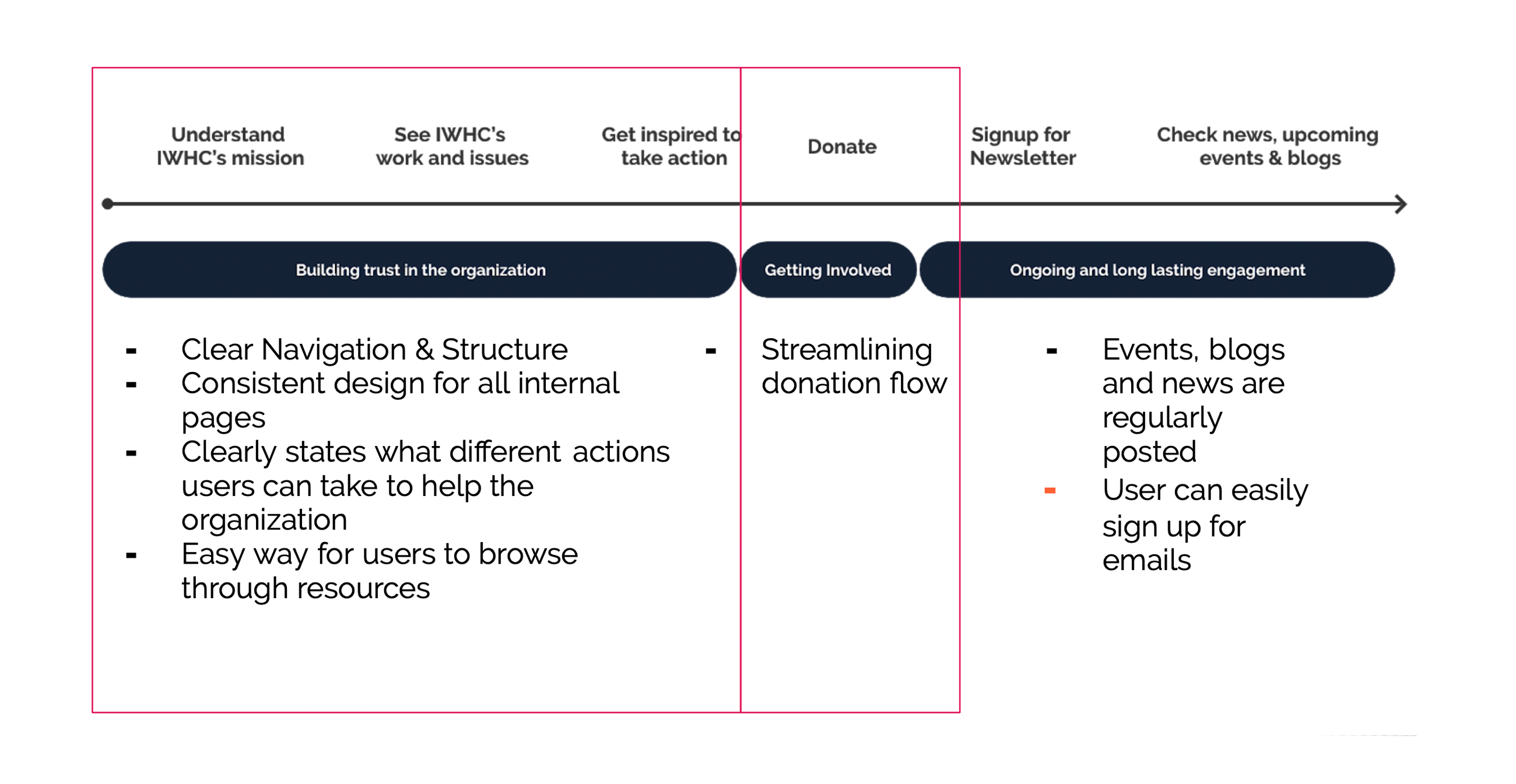
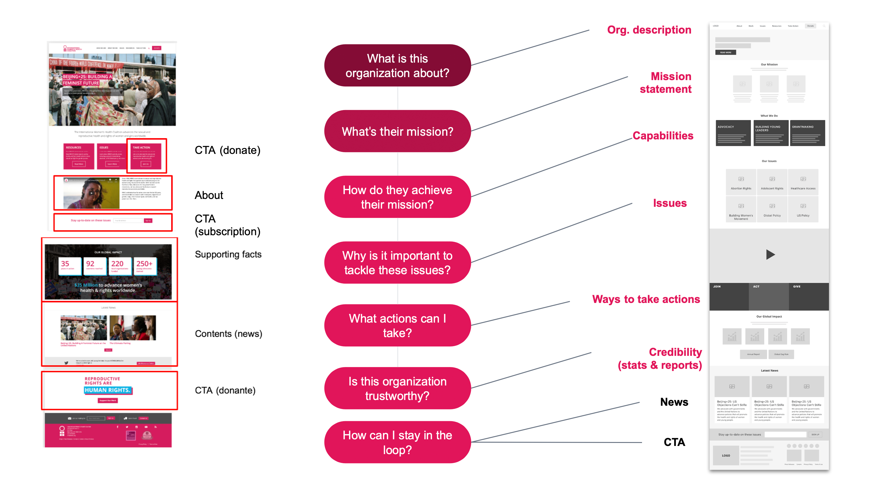
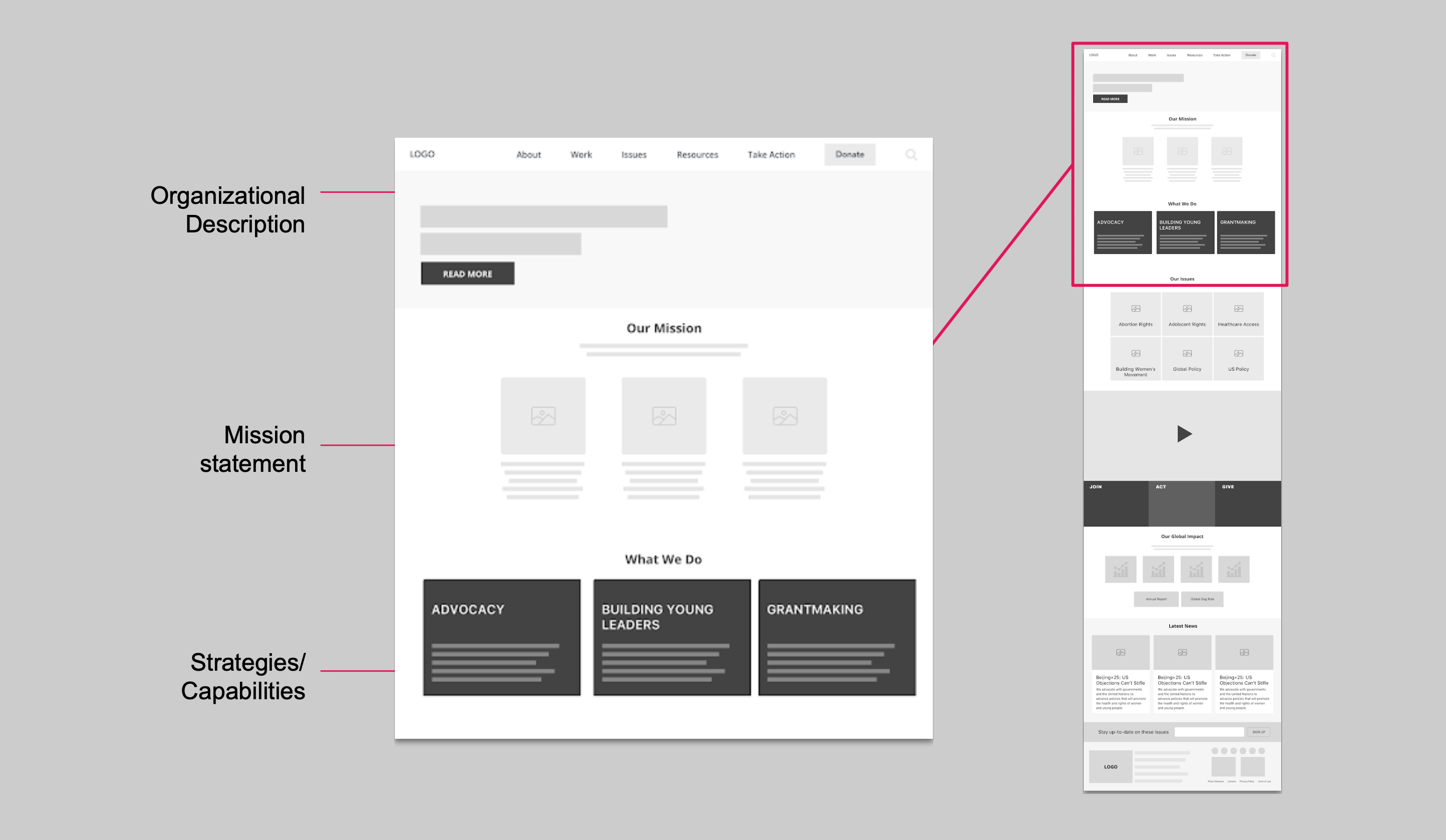
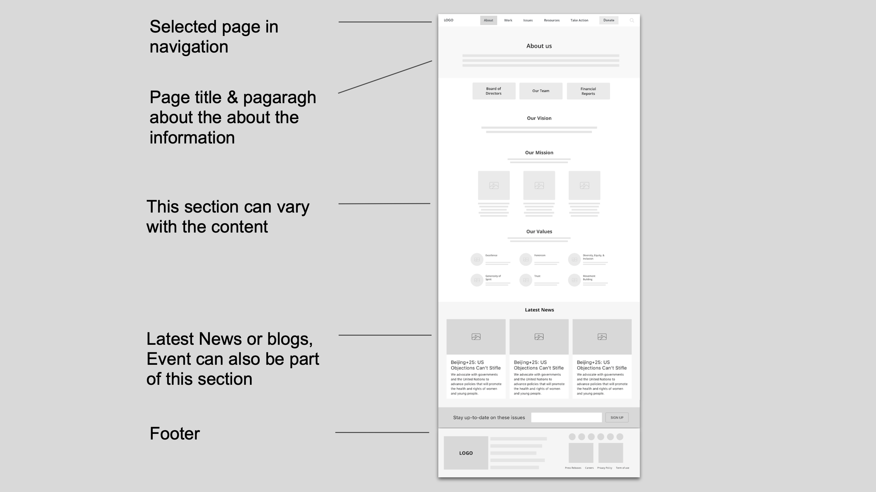
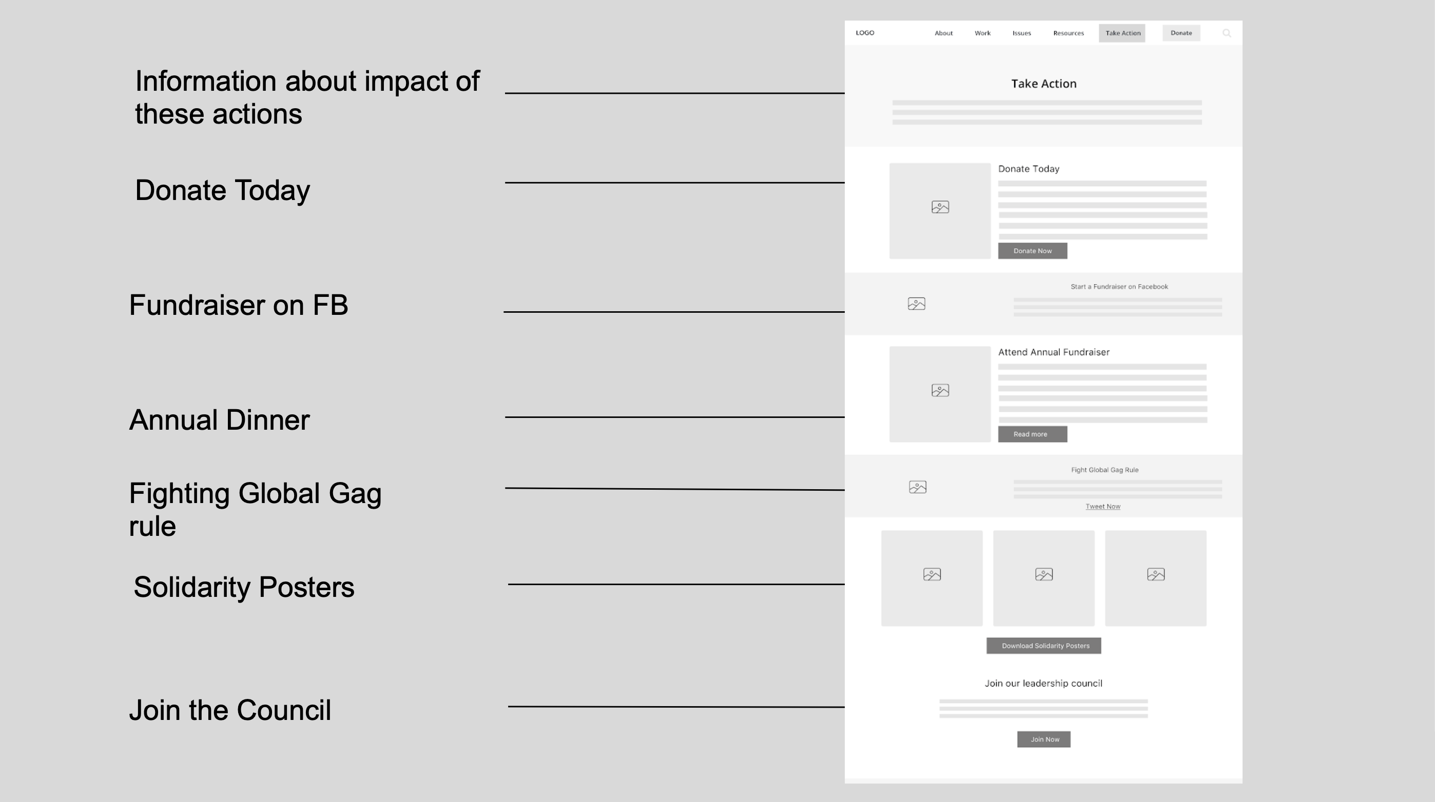
Improving content structure
Information that matches with user’s thought process
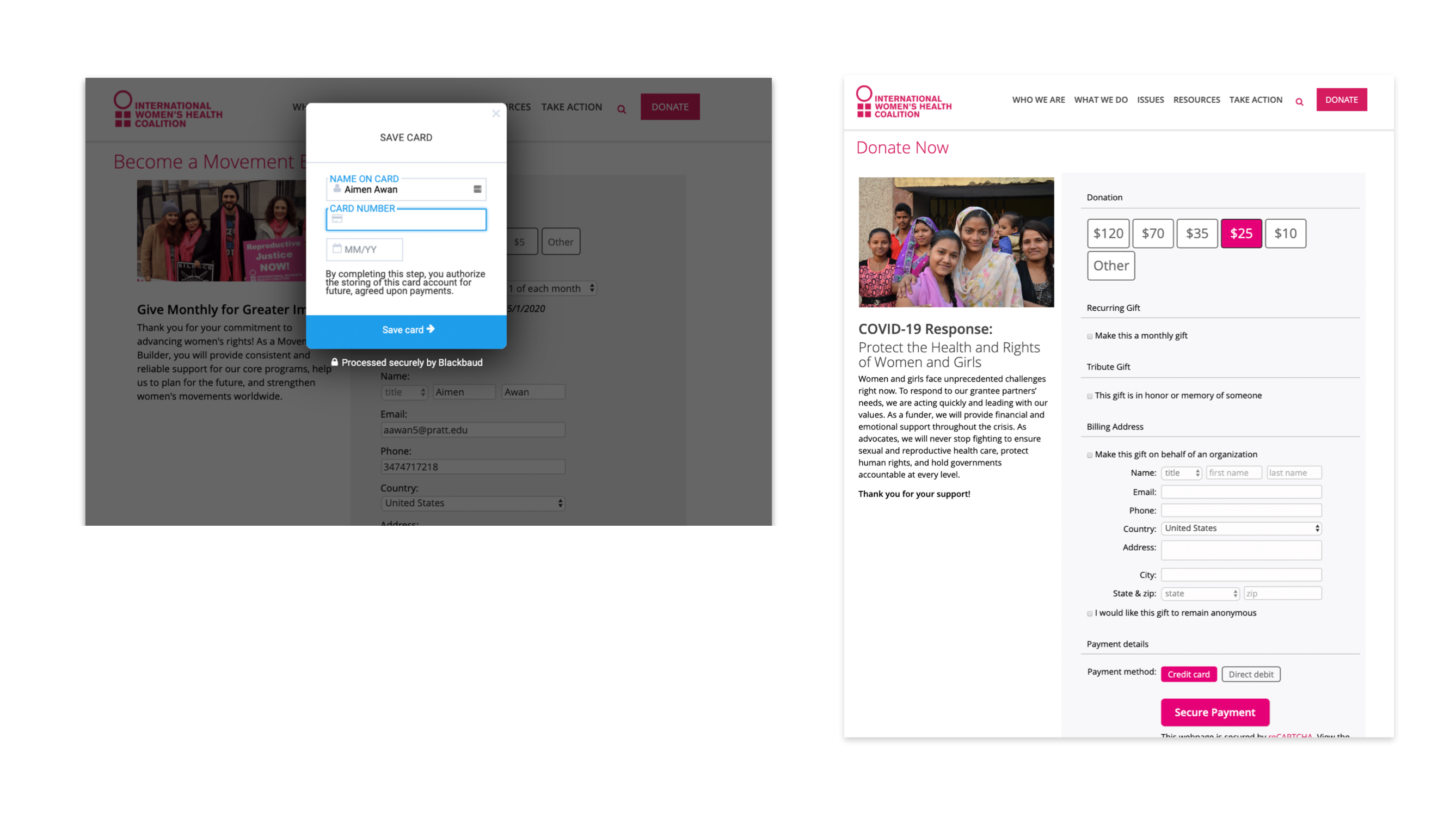
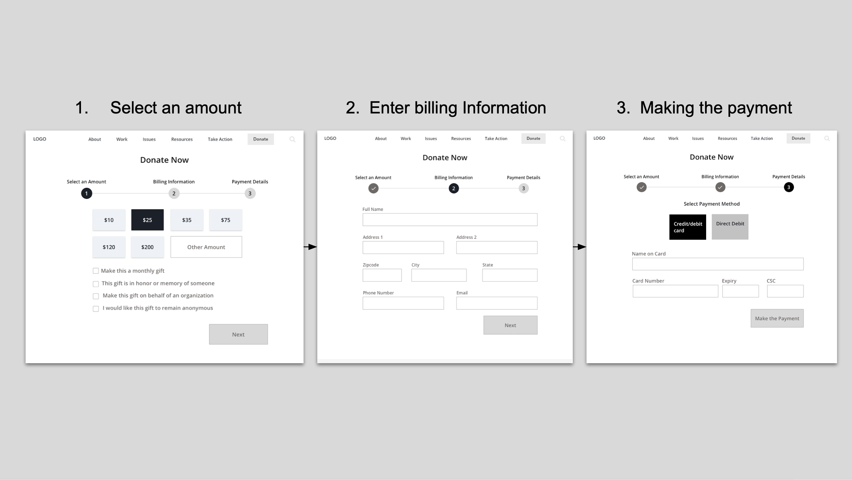
Clear call to actions
Consistent design for Internal Pages
On Current website, internal pages have inconsistent design and labels.User were unable to identify where they are on the website Information is not structured properly.
Browsing Experience for Resources
Users can have a difficulty finding resources because they were not able to search for what they were looking for.
Improved design for Take Action
In current design for take action, users need to scroll down to find the actions they can take. Most of the actions are not clear. To access all information, users need to click on dropdown in the main navigation.
Streamlining Donation Flow
Research conducted for Obama’s Donation campaign shows that segmenting donation flow increases 20% in digital donation;
External vendor might discourage users
Interactive Wireframes
Design Review
  • Donate Now or other call to action button in internal pages will encourage users to take an action.
  • Categorizing actions might help users understand them better
  • Social media links can be more prominent
  • Pop-up design for team members in team/board pages can be improve
  • Label for ‘Work’ might be misleading of confusing for users.
Hi fidelity Prototypes