Redesign of Seton Hall University Library

Website Redesign
Project Overview
This project involved redesigning the information architecture and the user interaction experience of the Seton Hall University library website. Seton Hall University is a private Roman Catholic university in South Orange, New Jersey.
Year of Completion: Spring 2019
Members Contributions
Group Members: Devanshi, Mingqi, Xin, Zachary
My Role: I was a UX designer, designing this product end-to-end from research to prototype.
Project Statement
How Might We make it easier for students to get help in every step of their research process?
Stakeholder Quote
“We want to prevent students from getting lost all the time.”
The Current Website is Not Ideal
- The website looks and feels very dated.
- Information is not structured properly
- Proper hierarchy has not been established
- There is no template for the site and every page looks different from the other
- It hasn’t been optimized for mobile
1. Understanding Users
We used two research methods to accurately find out how comfortably students were using the library website and what they they actually used it for.
User Group
The main user group includes: Undergraduate, Graduate and Professionals.
Persona
Observation (2 participants)
Focus more on experience of using library website
Exemplar Sites: library.nyu.edu / library.cornell.edu
Task 1a: Using the NYU library website, find 3-5 resources, at least 2 physical and 1 digital, about Information Architecture.
Task 1b: Figure out when and where you can pick up your book(s).
Task 2a: Using the Cornell library website, find 3-5 resources, at least 2 physical and 1 digital, about Information Architecture. Copy the links to the document.
Task 2b: Figure out when and where you can pick up your book(s).Questions for after the observation: Which site do you prefer? Why? What was frustrating or difficult?
Questionnaire (15 Responses)
Focus more on demographic features and usage
Results
2. Information Architecture
Users didn't even know what services the university library offered. So we did a cart sort to figure out a better way to structure the content.
Card Sorting (8 participants)
An online card sort was carried out using Optimal Workshop in order to understand how users group items that would help design the information architecture and navigation paths for Seton Hall Library’s website.
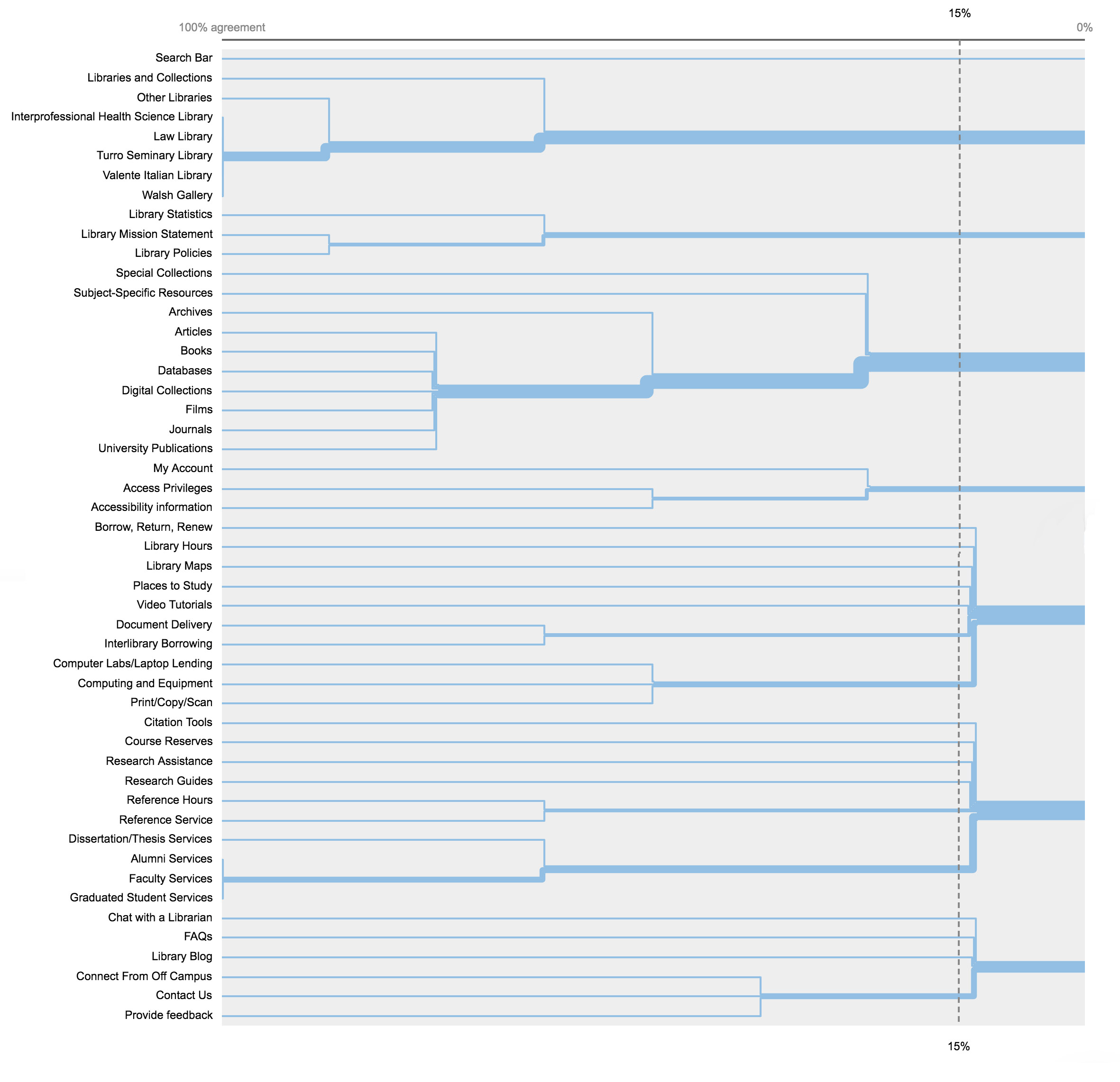
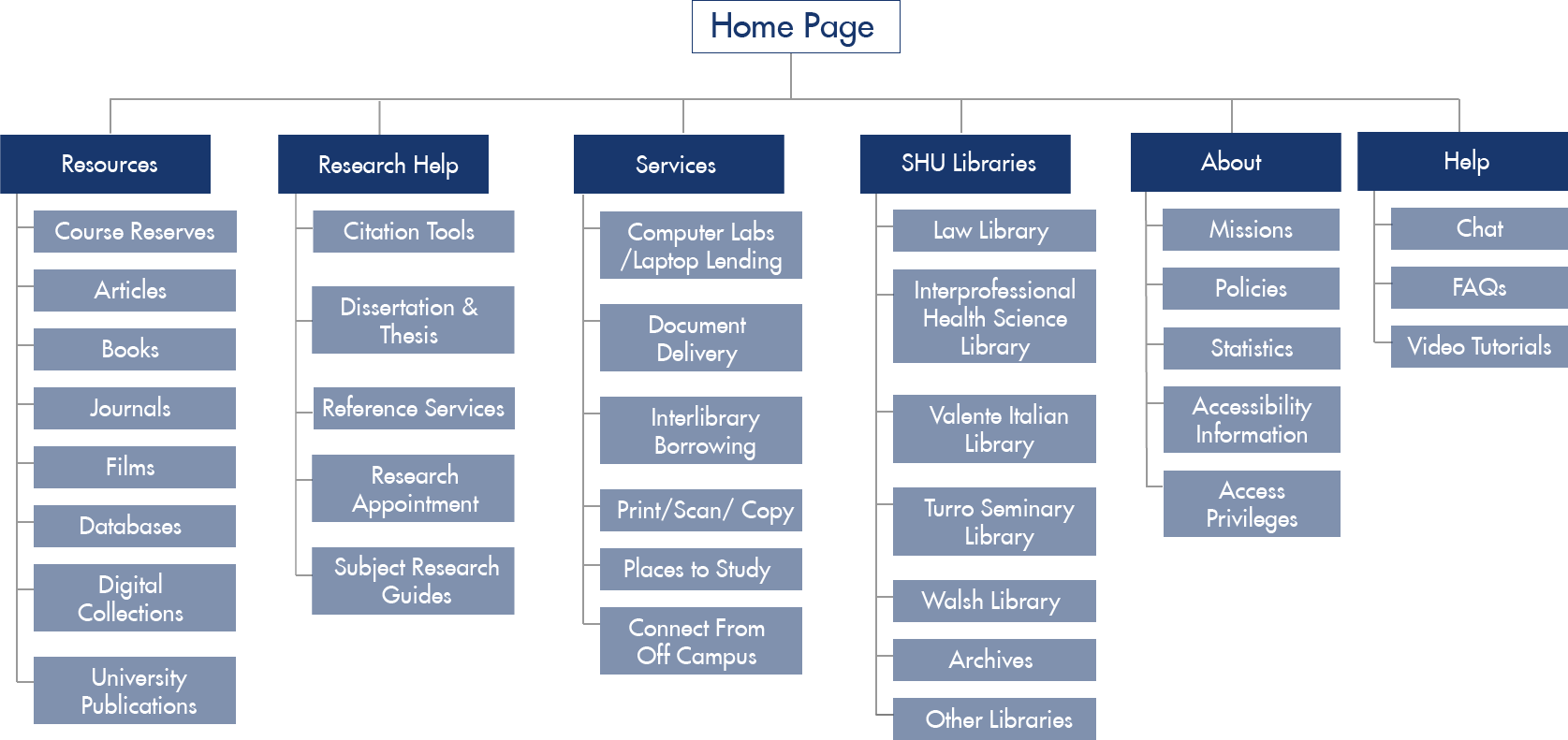
The process started with studying and analyzing the website’s existing site map in order to create and rename content labels for the card sort.
A total of 50 cards were used for the study, most cards used original labels while a few unclear or non-intuitive ones were renamed. After pilot testing the card sort and refining it, the test was completed by a group of 8 participants.
Most of them grouped the cards into an average of 7.8 groups. With the Similarity Matrix tool from OptimalSort, we were able to pair the most related labels (with over 62% score) and divide the existing ‘Services’ category into 3 sub-categories and the ‘About’ category into 2 sub-categories for easier navigation.
Tree Testing (10 participants)
Based on the results of the card sort, a tree test was created and conducted to further examine the information architecture we proposed.
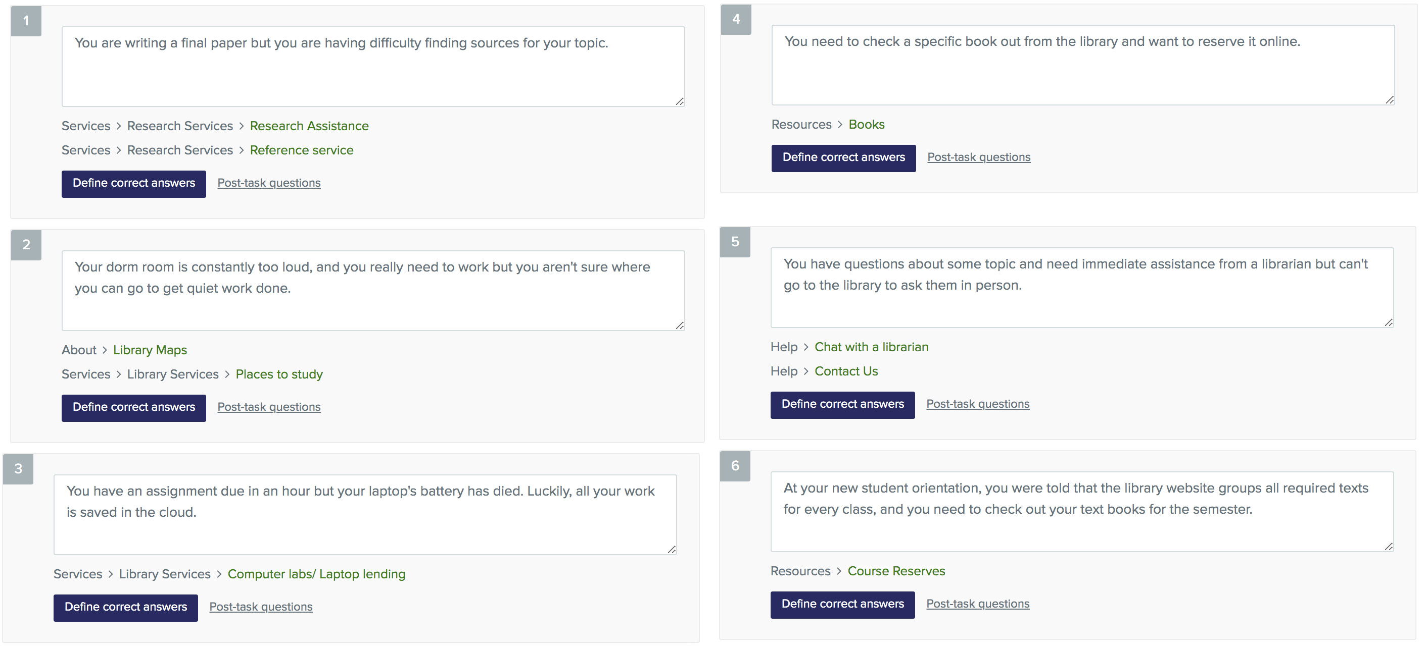
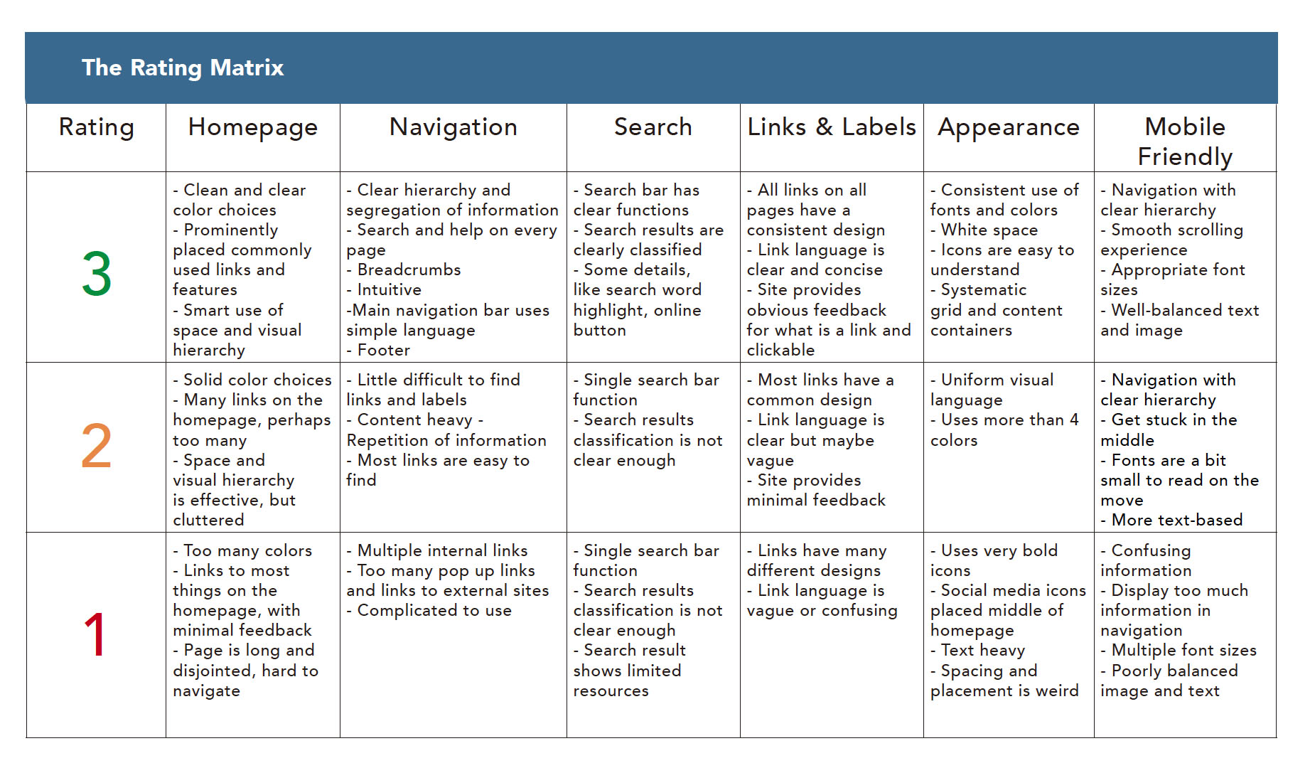
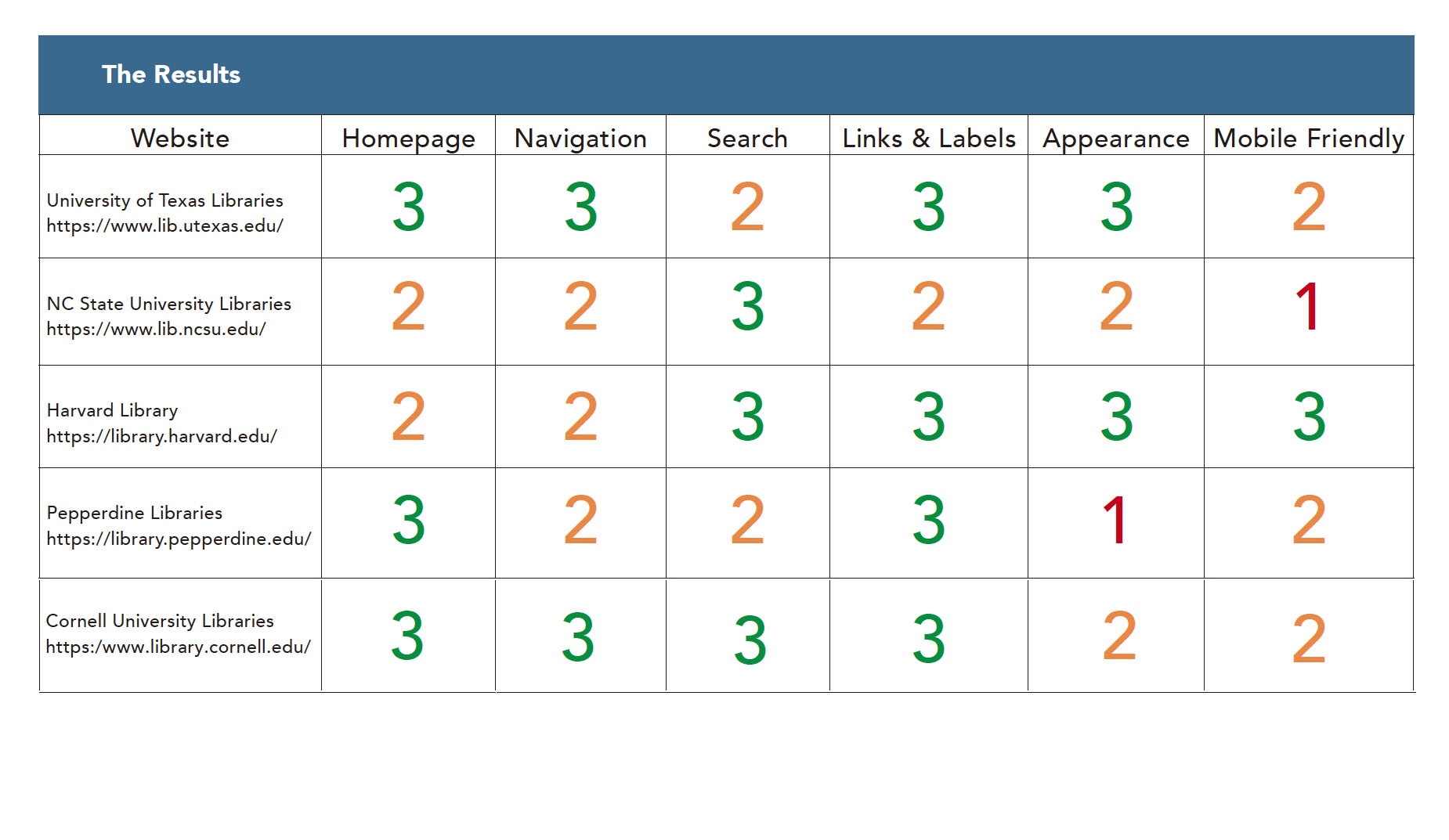
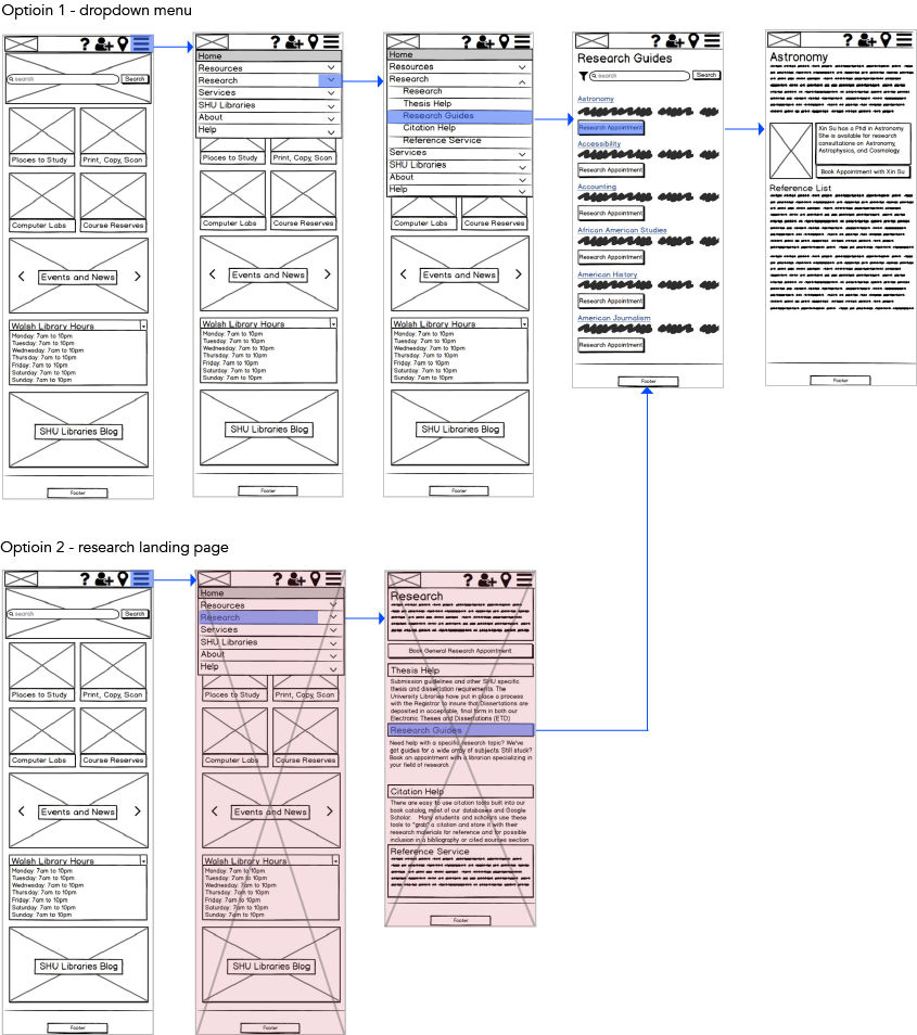
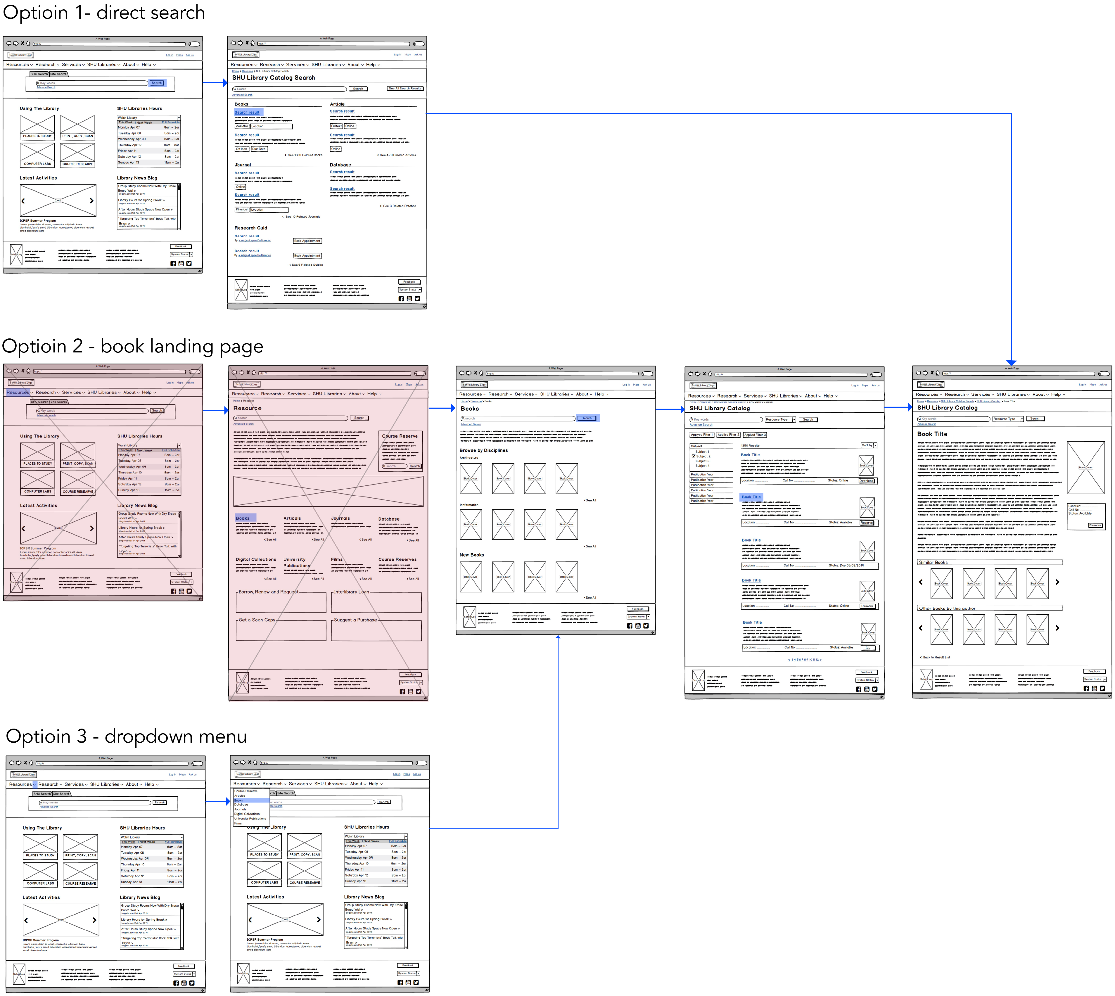
The tree test had 5 main categories with up to 3 levels of information. 10 people participated in the test with 6 potential library scenarios.
We achieved a 67% success rate and a 55% directness rate. Only 2 participants were able to successfully complete one of the tasks due to an error on our part creating the task.
Although the overall IA is working well, we revised the language, list order, and groups based on the results.
Tree Testing Result
Key Findings
Revised Sitemap
3. Competitive Analysis
We examines 5 university library websites. Each website was evaluated based on 6 dimensions - homepage, navigation, appearance, search, links and labels, and mobile-friendliness.  The websites were rated on a scale of  1-3 for each dimension, 1 being the lowest and 3 being the highest rank.
Key Findings
  • Homepage
    Simple Color Schemes are The Best.
    Drop Down Headers are Important.
    Limit the Amount of Content.
  • Navigation​
    Breadcrumbs
    Footer Sitemap
    Hierarchy of Information
  • Search
    Use Optional Search Bar
    Clear Classification is Essential
    Small Details are Useful
  • Links and Labels
    Consistent Link Design is Key
    Use Clear and Descriptive Language
    Good Feedback is Fun and Useful.
  • Appearance
    Images Attract Attention and Ignite Curiosity
    Consistent Use of Grids
    Bold and Legible Fonts
    Consistent Visual Language
  • Mobile Friendly
    Floating Header
    Be Cautious with the Icons
    Use Sub-Menus Where Necessary.
4. Interaction Design

User Test - MVP

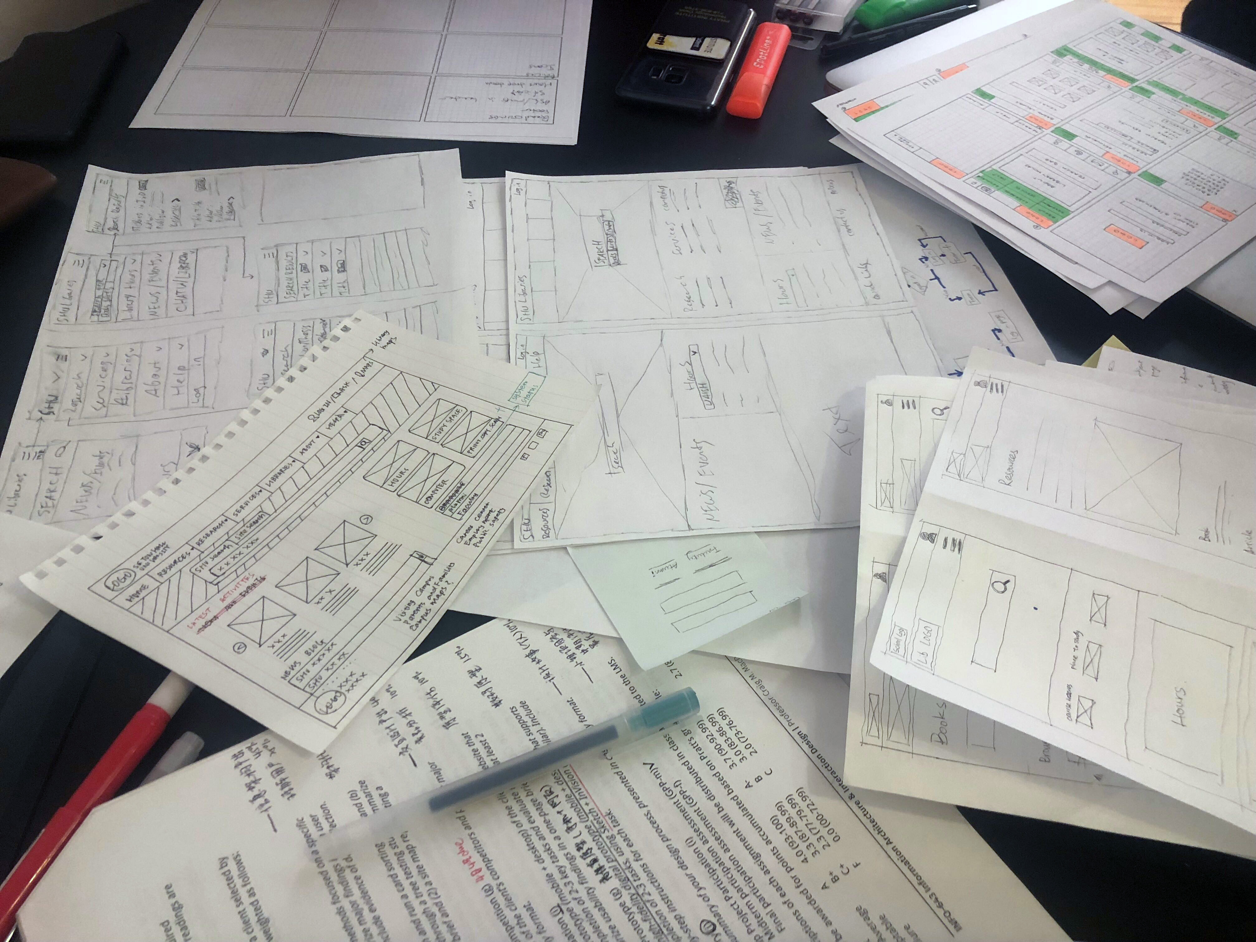
We started this process by creating task flows representing ideal user paths and built two low fidelity prototypes, one for desktop and one for mobile. Our prototypes are digital and are built using Balsamiq. Following that we conducted user tests on two users each.

Task 1: Book a research appointment (mobile test)
Task 2: Reserve a book (desktop test)
Usability Problems & Recommendations
Final Prototype (desktop)
User flow 1: Book a Research Appointment
User flow 2: Book a Group Study Room Reservation
Final Prototype (mobile)
Feedback
View Final Prototype